Step 1 of 3) Select a web design template
The first step in building your new website is to select a design for your website. You can change your template once you login to the CMS. If you don't find anything you like, please consider using the Vanilla options. Most templates can be customised with your own colours, banners and background images.
-
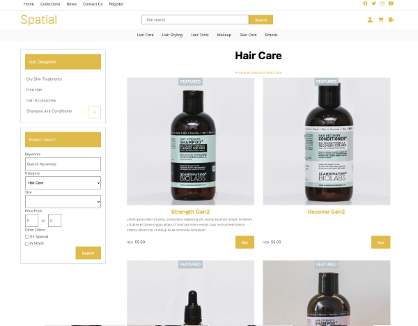
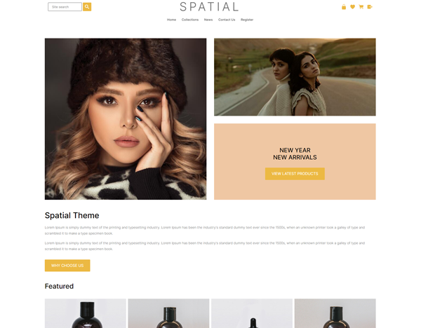 Spatial ThemeID: 131194
 -
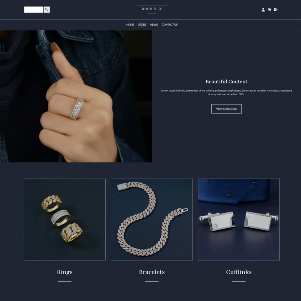 Mood E-commerceID: 133402
 -
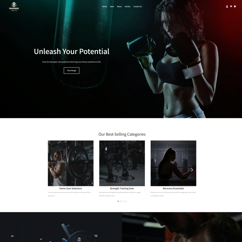 Powerhouse TemplateID: 133811
 -
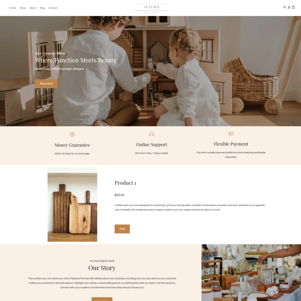 Autumn TemplateID: 133922
 -
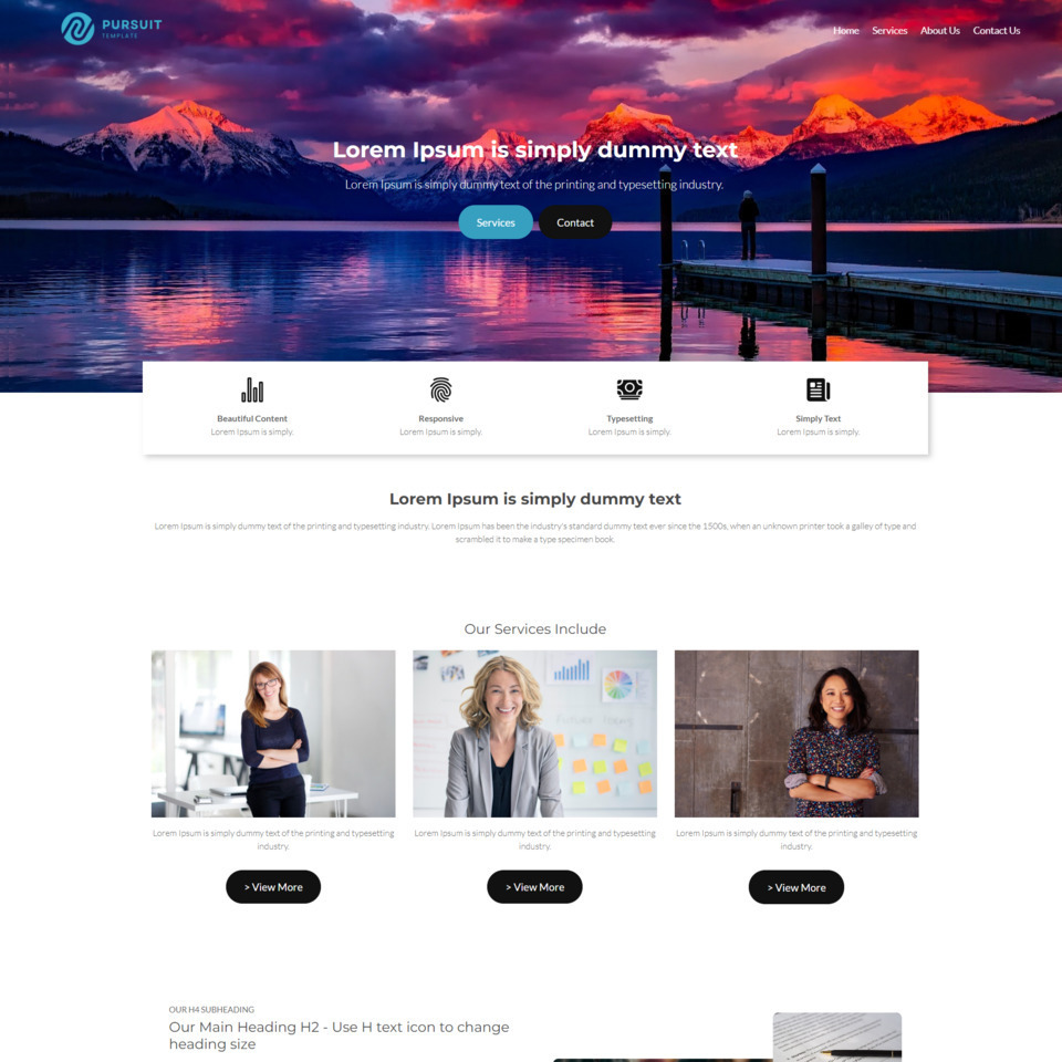 Pursuit Business TemplateID: 132969
 -
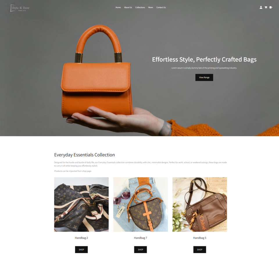 Style & Stow TemplateID: 133685
 -
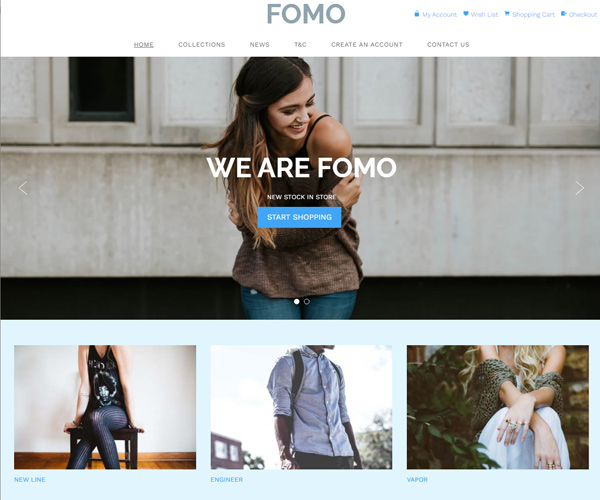 FOMOID: 125791
 -
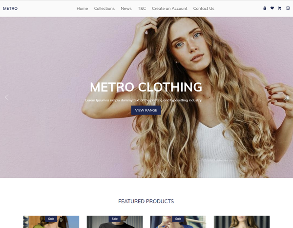 MetroID: 127782
 -
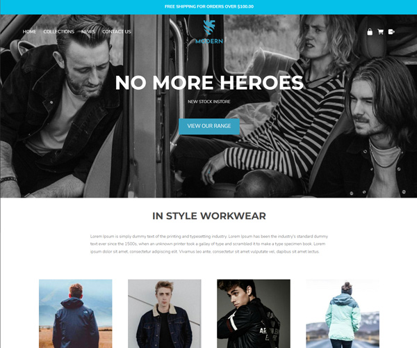 ModernID: 131773
 -
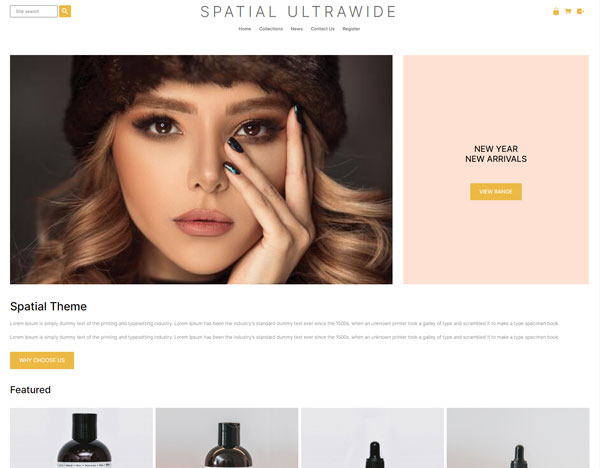 Spatial UltrawideID: 131609
 -
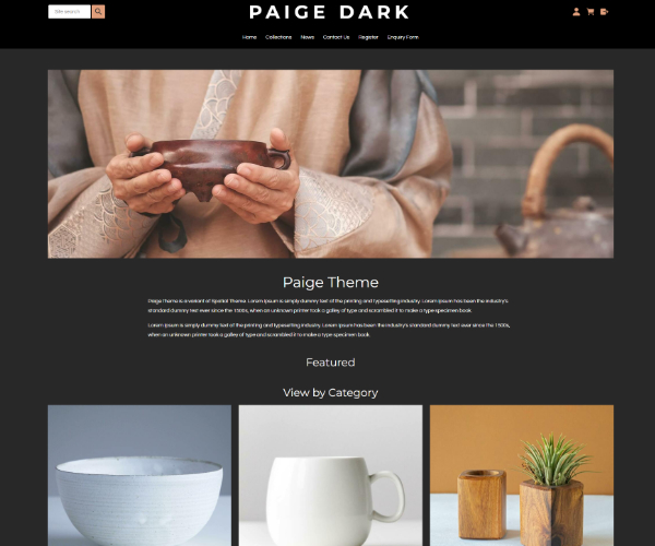
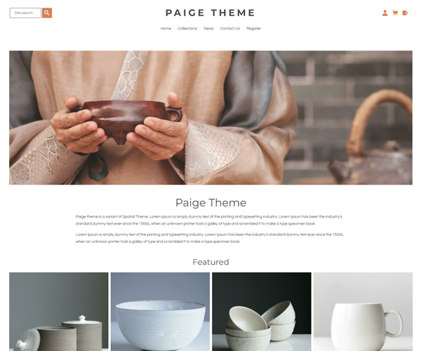 Paige ThemeID: 132236
 -
 Spatial InventoryID: 132943
 -
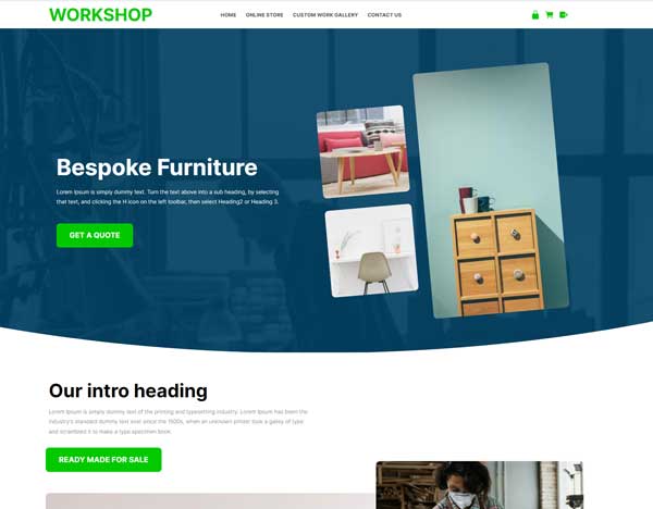 WorkshopID: 131413
 -
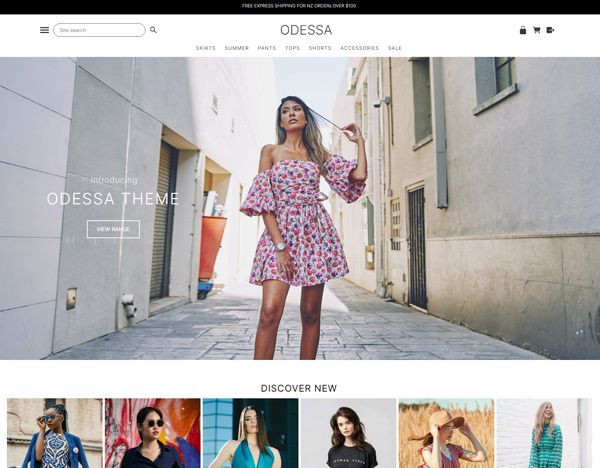 ODESSA THEMEID: 131763
 -
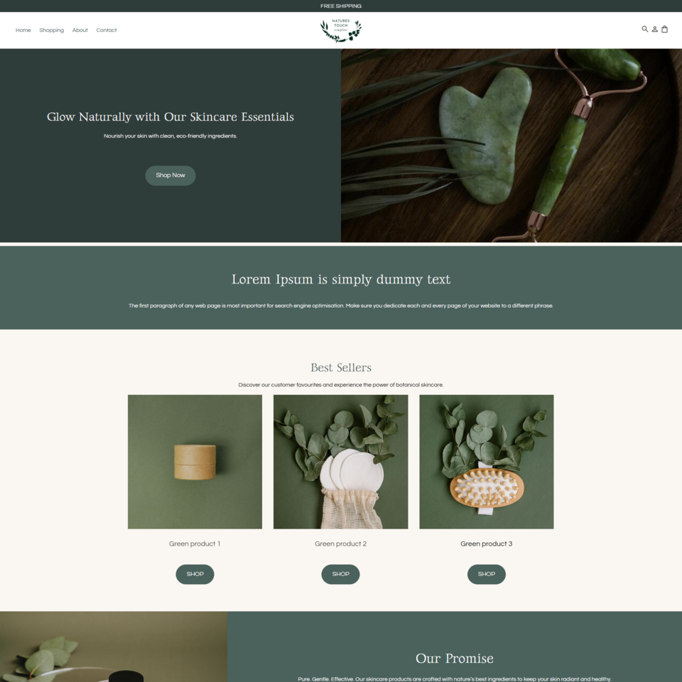 Nature's Touch TemplateID: 133718
 -
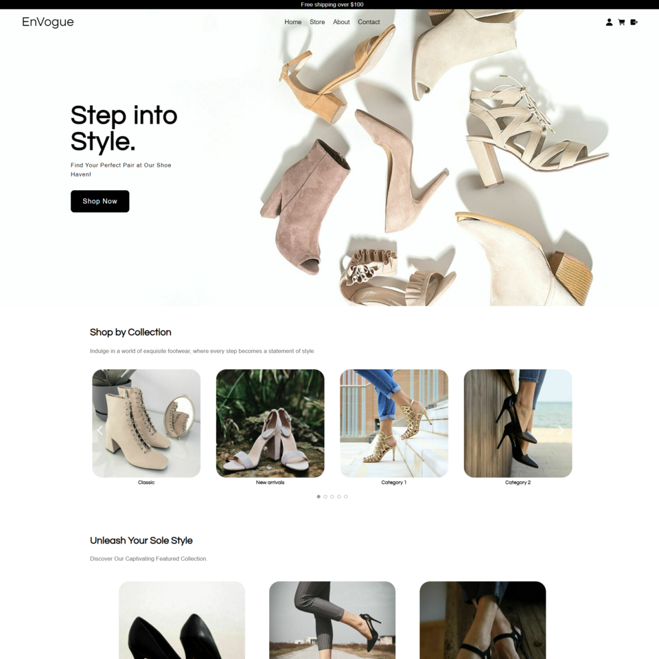 EnVogueID: 132429
 -
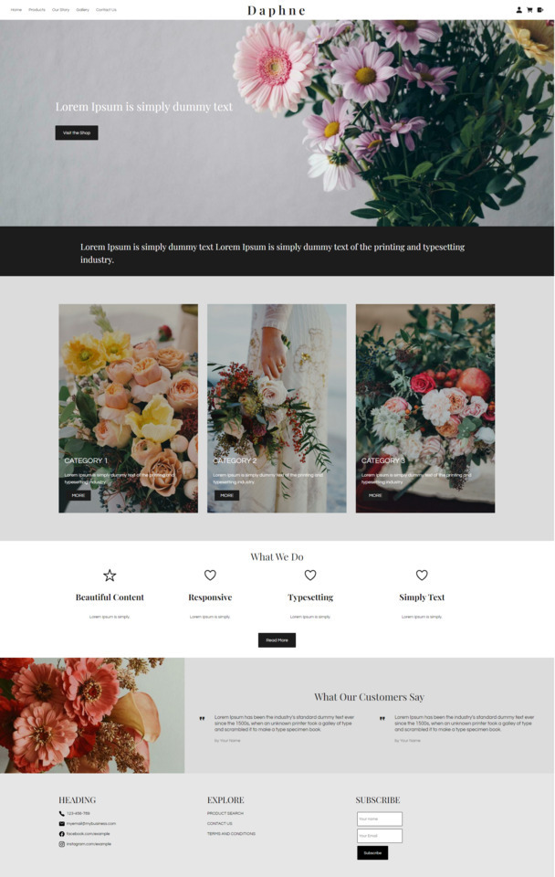 Daphne TemplateID: 133159
 -
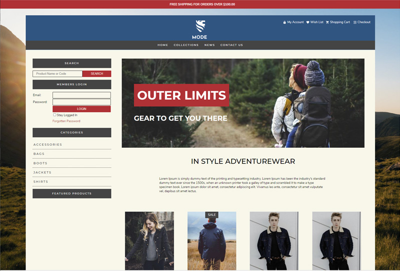
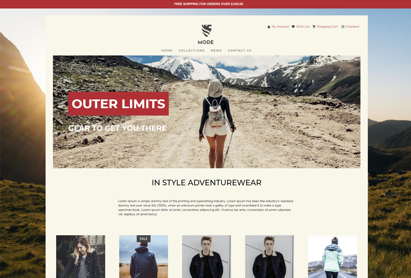 Mode NarrowID: 126980
 -
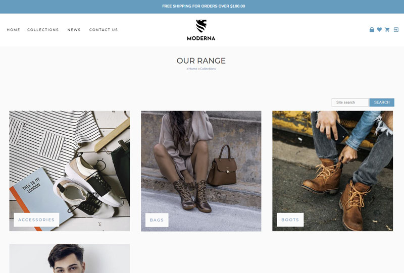 Moderna Ultrawide (Contentbox)ID: 126292
 -
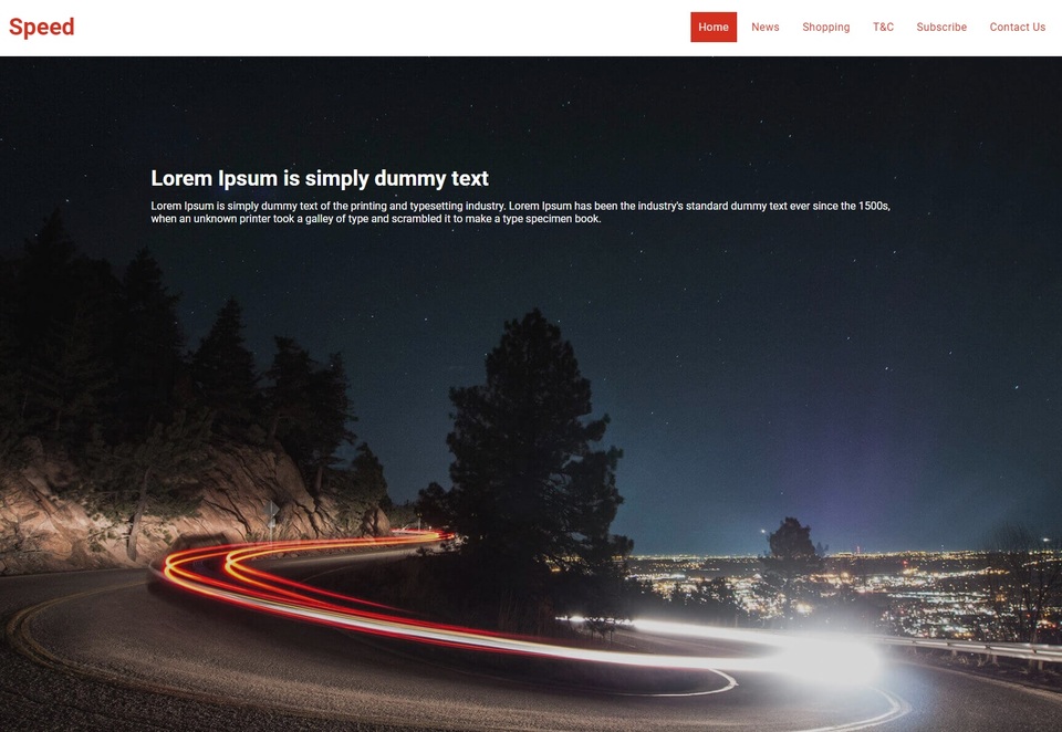 Speed - Content BoxID: 126175
 -
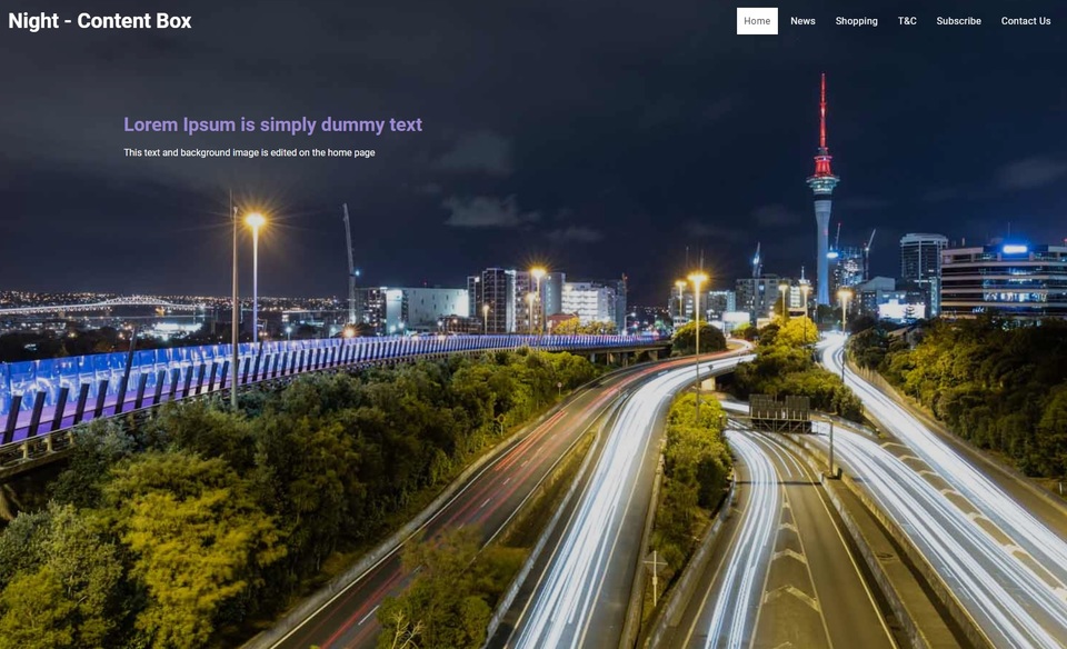 Night - Content BoxID: 126181
 -
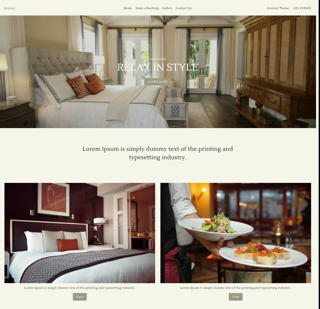 Journey Accommodation ThemeID: 132374
 -
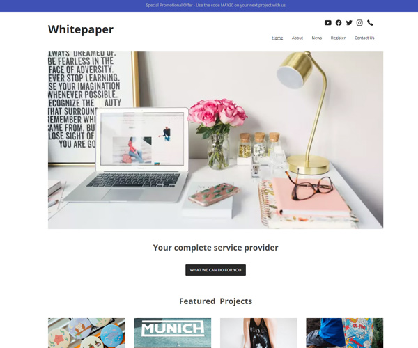 WhitepaperID: 126148
 -
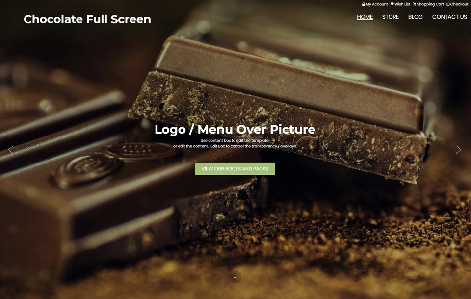 Chocolate Full ScreenID: 123808
 -
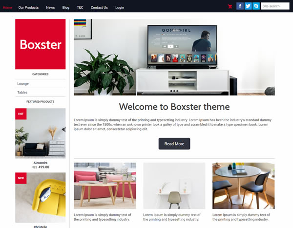 Mod Boxster (Legacy)ID: 123257
 -
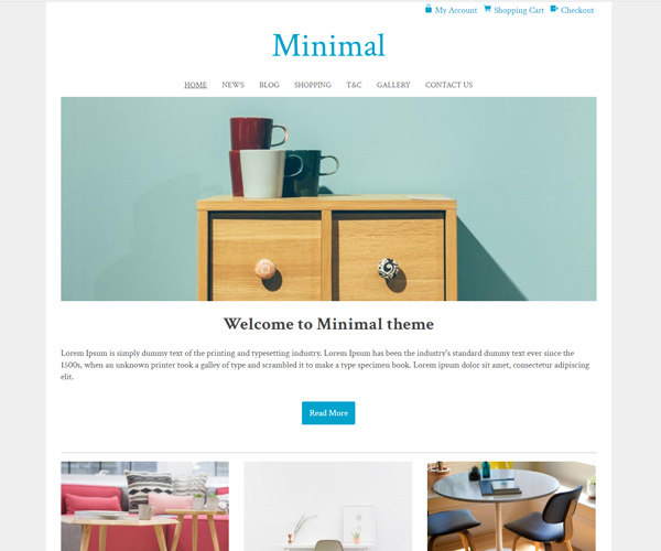 MinimalID: 114657
 -
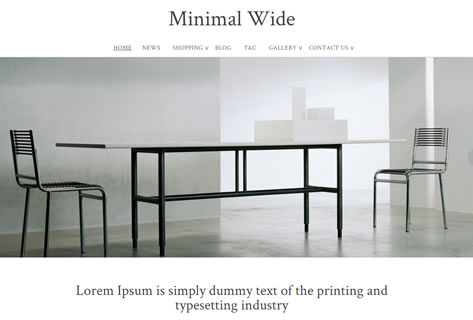 Minimal WideID: 111228
 -
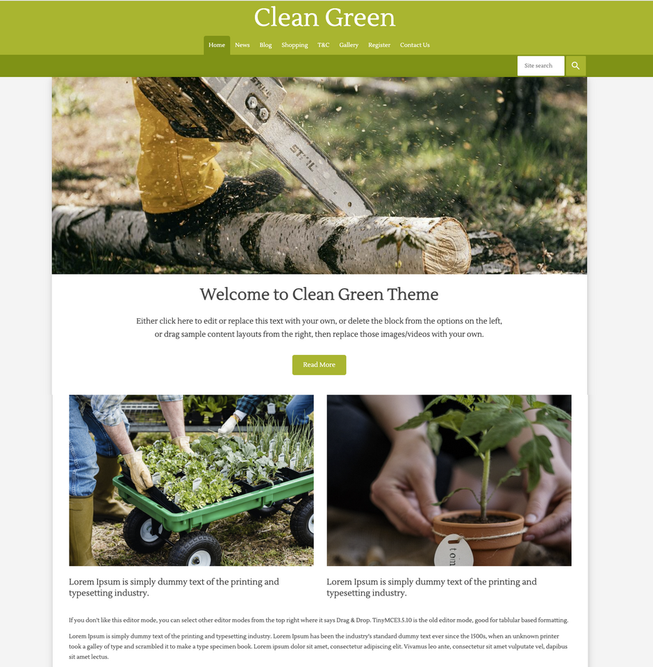 Clean GreenID: 132848
 -
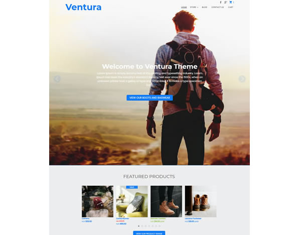
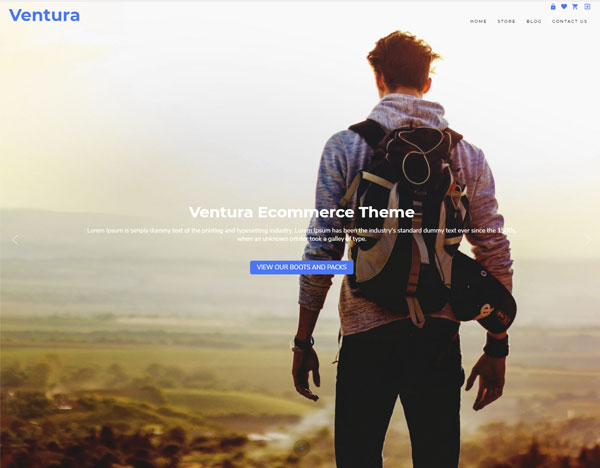 Ventura EcommerceID: 127191
 -
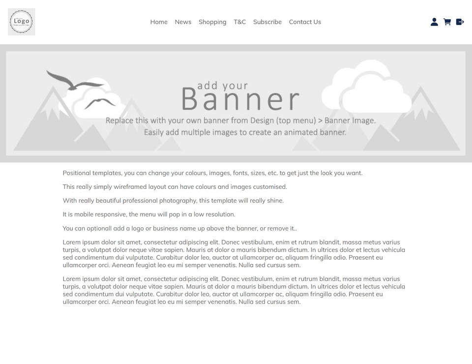 Positional Responsive Top Logo Menu IconsID: 132337
 -
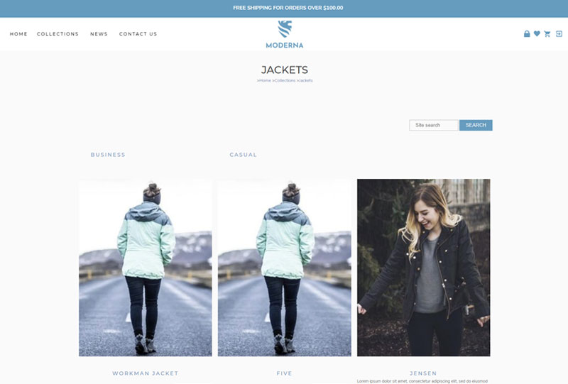 Moderna (Legacy)ID: 126324
 -
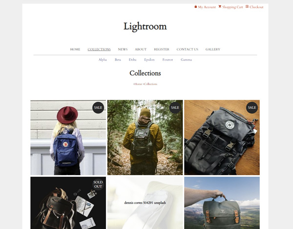 LightroomID: 127382
 -
 Ventura Ecommerce [Legacy]ID: 123109
 -
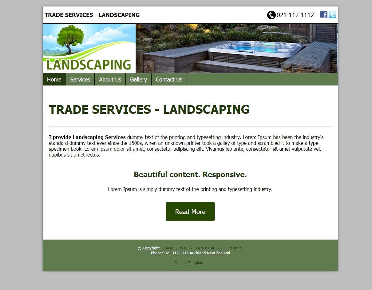 TRADES & SERVICES - LANDSCAPINGID: 115868
 -
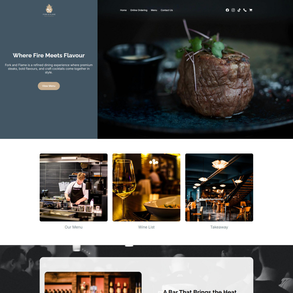 Fork & Flame TemplateID: 134277
 -
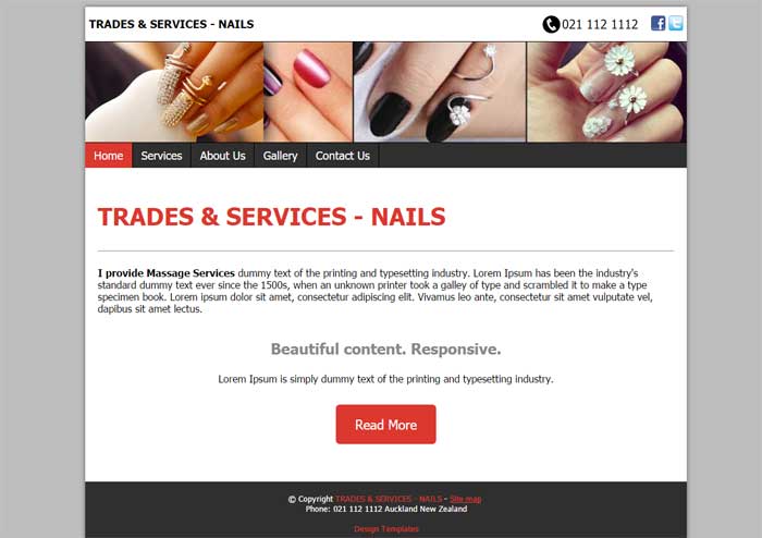
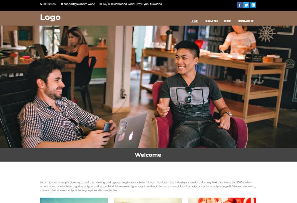 Content Box Service Provider with Mobile MenuID: 131414
 -
 Paige DarkID: 132250
 -
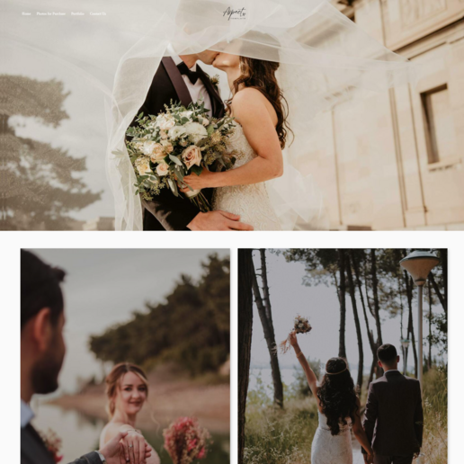 AspectID: 132663
 -
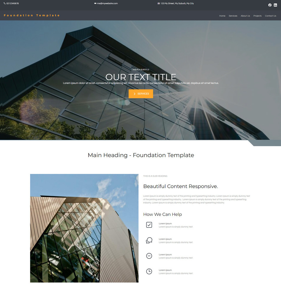 Foundation TemplateID: 133536
 -
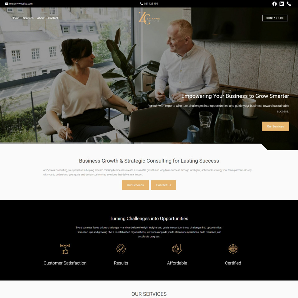 Zytravia Brochure TemplateID: 134346
 -
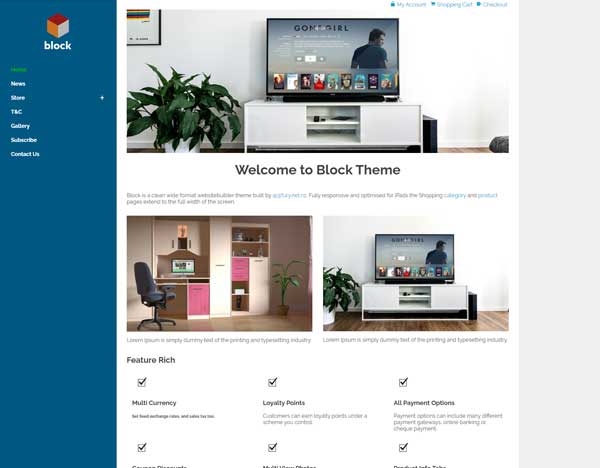 Block EcommerceID: 130563
 -
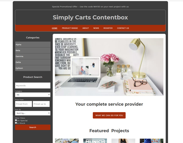 Simply Carts ContentboxID: 126548
 -
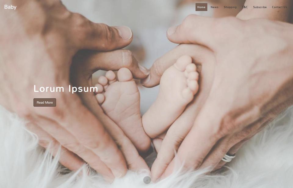 Baby - Content BoxID: 126193
 -
 Logo and MenuID: 129790
 -
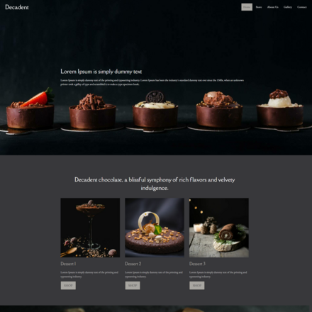 DecadentID: 132623
 -
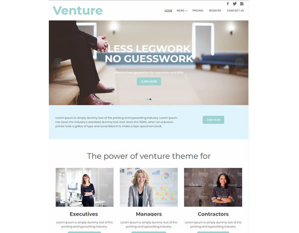 VentureID: 129874
 -
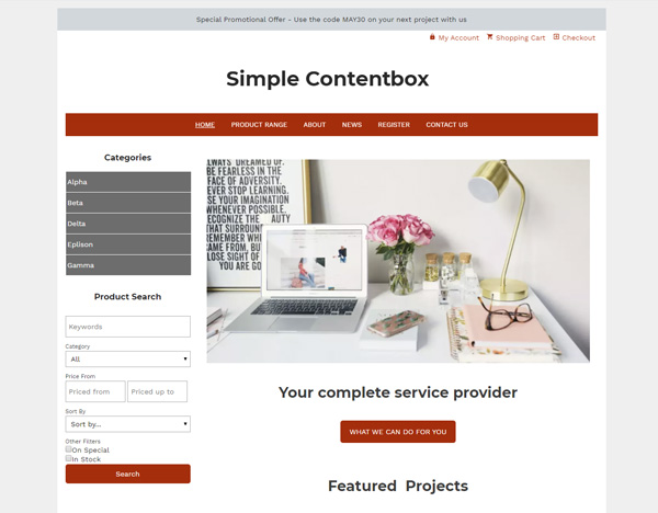 Simple ContentboxID: 126780
 -
 Mode InventoryID: 127284
 -
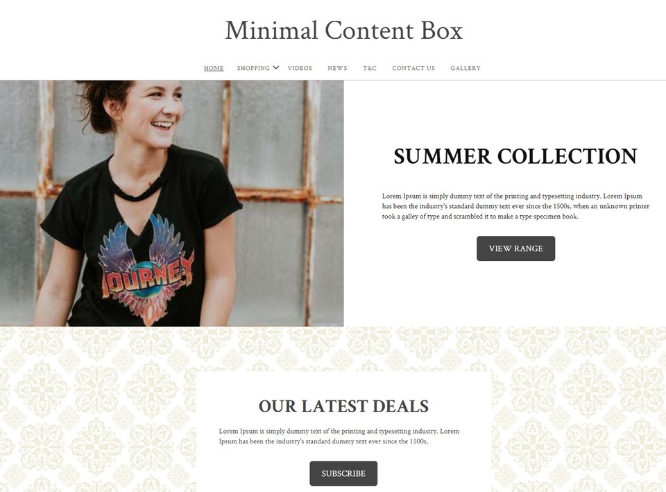 Minimal ContentBox (100% Wide)ID: 125788
Notes on Mobile Responsive Design
All our website themes typically utilise a separate mobile template which is more streamlined and faster to download than a dimensional responsive mobile design. However, only these themes listed above utilise reponsive design techniques as commonly referred in the web design community. Note that some mobile phones have high resolutions on small screens, and some responsive designs may not apply correctly on all phones. Also not all mobile users appreciate a payload of 300kb javascript and CSS files being downloaded before they can see anything.. Shopping carts and certain content is always mobile responsive, irrespective of the theme you choose. However, in our dedicated mobile modes, all content will be easier to read, and all buttons easier to touch. We encourage all users to use dedicated mobile mode for the most functional and fastest user experience on a mobile.
Didn't find anything you like?
Please choose from another category located above the template chooser - we recommend positional templates. The positional templates allow you to upload your own banners, logos, change background colours and more. Advanced web designers can update their CSS stylesheets and HTML templates. If you want a website design transferred from an existing website or a 3rd party template, then please contact us for a quote to transfer your design, or follow the instructions in our advanced FAQ area.
Or Search by Name/Keyword/ID
Buy NZ Made