There are a few different ways to make your website awesome for the mobile experience
- Responsive Mobile Website Template (Recommended)
- Dedicated Mobile Website Template
- Completely Separate Mobile Websites
Responsive Mobile Website Templates
Responsive templates are a popular approach in the web design industry, because not every CMS can provide a dedicated mobile template option. Responsive design means that the template has been specially crafted to change shape in different browser widths. Responsive templates can be difficult for users to edit themselves, as each element needs to be especially crafted.
For example, menus might be condensed, or relocated off page, and pulled in when needed. Responsive websites tend to be slower to download on mobile devices, as the mobile device needs to download all the styles/themes that are used in the desktop version, even if not used in the mobile version. Some web designers focus on making great looking templates, but they forget about these download speed issues.
If your website is tourist oriented, your customers may be out and about on the edges of mobile phone coverage, and they might have trouble downloading all the additional JavaScript and CSS libraries that are not required for the mobile experience. Responsive templates are often slow to download, but we have been working hard to make our new responsive templates as fast as they can be, and our responsive templates will render about 3 times faster than the average WordPress theme. Our responsive websites can be customised with different colours, fonts, and images.
Dedicated Mobile Website Templates
A dedicated mobile website template is the traditional way we have provided backward compatibility for all our desktop websites to offer their customers a mobile experience. The mobile template uses the same navigational sitemap, and same content as your desktop website. However, we trimmed off all the unnecessary clutter to ensure your customers could quickly get to the information they want. For example, navigate to your contact details, view a map link, or view your products and make a purchase easily on their small screens. Over time we have added banners, logos and auto matched the colours to your desktop template. With fine tuning to your dedicated mobile template design, your customers will have an awesome experience, as this method is the fastest option for customers using slow rural mobile connections.
Completely Separate Mobile Websites
Having a whole website crafted just for mobile might give a really good mobile experience at first, but more often than not, the webmaster forgets to maintain it (or cannot maintain it) , and the information become out of sync in each website. If you are running an online shopping site, you really need to have both your mobile experience and your desktop experience powered by the same shopping cart engine. We advise our customers not to use this approach.
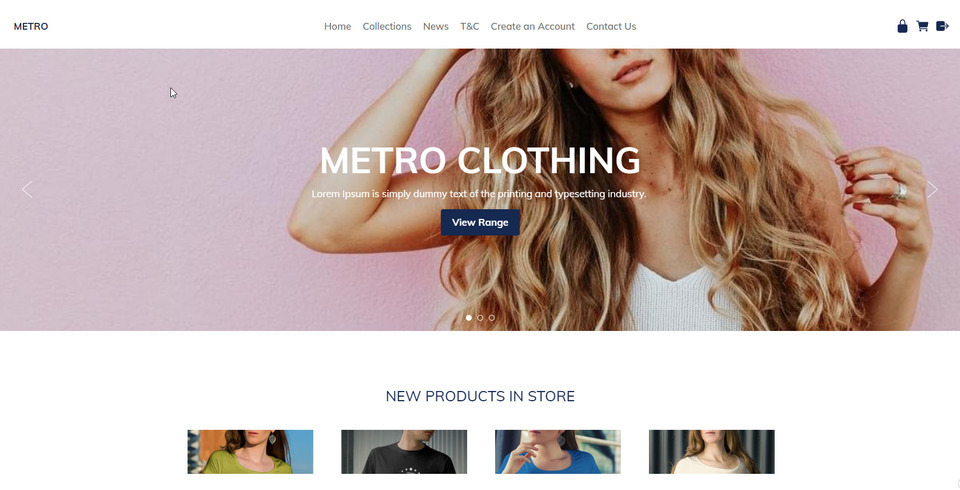
Our Most Popular Theme
The Metro template is currently the most popular theme selected by our users. With a simple white background, and a big beautiful images, you can create a great looking website.
The Minimal Template ID: 114657 has the pretty much the same look in both dedicated mobile mode, or responsive mode.
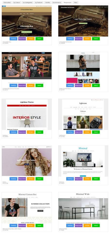
Range of Templates
Our responsive templates are wide on big screens, just right on small screens, and fast and beautiful on the smallest of mobile screens.
Our responsive templates can be customised by you:
- Animated Banners
- Logo or Business Name
- Rich content formatting using the Drag-drop and Contentbox Editors
- Background Image, Colour or Texture
- All colours selectable
- Custom fonts, sizes, and linespacing
How to Convert Your Existing Website to A Responsive Template
We have lots of different responsive templates that you can choose from. We are updating more all the time. When you change to a responsive template, it will update both your desktop and mobile layouts.
- In the CMS, go to the DESIGN tab
- Select CHANGE THEME
- Look through all the themes, and take note of the RESPONSIVE or MOBILE button. This button allows you to preview the theme in either mode. Only the themes with RESPONSIVE button are responsive templates.
- SELECT a theme to continue.
- Untick the boxes for changing banner, logo, background and colours, if you want to keep your existing brand elements the same.
- Tick the box to backup your old design settings, just in case something goes wrong.
- Save the theme change.
- Sometimes when you preview your website after a theme change, it might not look right, due to browser caching settings. You may need to PUBLISH and clear your browser cache, to see your website looking right.
- Sometimes you may need to reapply your colour settings for menus etc, as some templates provide the default colours, and others don't, or perhaps your colour combinations are not immediately compatible with the template, and may need some fine adjusting.
How to Select A New Dedicated Mobile Template
We have 8 different dedicated mobile templates, but each will use the colours and font from your desktop theme.
- In the CMS, go to the DESIGN tab
- Select MOBILE TEMPLATES
- click SELECT A NEW MOBILE THEME
- Look through all the themes, and take note of the RESPONSIVE or MOBILE button. This button allows you to preview the theme in either mode. Only the themes with RESPONSIVE button are responsive templates.
- SELECT a theme to continue.
- Untick the boxes for changing banner, logo, background and colours, if you want to keep your existing brand elements the same.
- Tick the box to backup your old design settings, just in case something goes wrong.
- Save the theme change.
- Sometimes when you preview your website after a theme change, it might not look right, due to browser caching settings. You may need to PUBLISH and clear your browser cache, to see your website looking right.
- Sometimes you may need to reapply your colour settings for menus etc, as some templates provide the default colours, and others don't, or perhaps your colour combinations are not immediately compatible with the template, and may need some fine adjusting.

Tips On Mobile Responsive Content
If you want the best user experience for mobile devices, your content needs to be mobile responsive too. Many of our customers have used our old TinyMCE editor mode to create complex table structures, with lots of rows and columns to layout images and text just so. This sort of layout will not automatically adjust to a small width screen, and some of that content maybe clipped or require a scroll bar to access.
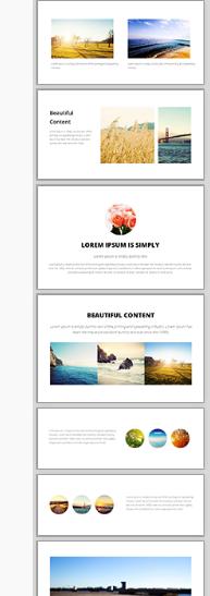
The best content editor for beautiful responsive content, is our new Drag and Drop editor. See the snippets on the right. Drag these snipped into your content area, and then edit the text, images and links.
These display widgets already know how to auto adjust themselves into a beautiful stacked layout when on a narrow screen.
Generic Responsive Content
All of system generated content has already been optimised for mobile responsive layouts. This includes:
- Popup Slideshows 95% max width
- Shopping Carts and Checkout Pages
- Inquiry Forms
- Membership Forms
If you find any system generated content that does not look right in a responsive mobile template, please let us know and we will fix it asap.
Tweaking Your CSS To Be Mobile Responsive
If you are technically minded, you might like to just hack your existing template into CSS responsive mode.
Look for lines in your stylesheet with the biggest dimensions of either 600px, 750px, or 900px:
#container { width: 750px; margin: 0 auto; }
And change them to be like this, where it fulls 90% of the screen width up to a max of 960.
#container { width: 90%; max-width: 960px; margin: 0 auto; }
Then look for columns, and change their widths or margins from fixed widths, to % widths, but only apply those widths when the screen width supports it. When the screen width is less 600px, the columns will become stacked in the full width of the browser.
@media (min-width: 600px) { .leftColumn { width: 20%; float: left; }
Previous Notes on this page:
Yes, all our websites automatically display a mobile optimised view of your website for all common mobile formats.
All your desktop mode clutter is hidden, and a focus is placed on the content and primary navigation. The default option is a separate "mobile template" that renders all the same content, using the same site map as your full desktop version. By default the mobile template looks simple and easy to navigate with big fingers on a small screen.
- All lists and galleries are converted to easily clickable elements.
- Images fit within the screen size.
- The main menu is accessible via a simple single MENU button at the top right, or by scrolling to the end of the page.
- A search box is available on the end of all pages
- We have doubled the size of text and input fields on high resolution mobile phones 720px screens
- A "full site" button will take the user back to the desktop experience.
- Further customize the default mobile mode with your own custom template, or insert banners and colours and styles.
- Disable the mobile mode and show your desktop version on all devices (good for simple desktop layouts)
- Disable the mobile mode and build your own responsive CSS template
- Disable the mobile mode and select a responsive design from our template range (look for responsive keyword)
- Mobile mode is not used on ipads or large format devices, where the preferred experience is full screen.. But you are welcome to modify this with your own responsive rules.
- Mobile template mode is not automatic when viewing a trial site via a mobile, but you can view the trial mode via the CMS under design options, mobile templates, view mobile mode.
- Mobile template mode is connected to your live domain, and if enabled, and when it matches a known list of mobile phone types, it will automatically redirect them to the mobile mode on the same base domain.
- Published pages are ignored in mobile mode, all lists and menus will direct you to a live dynamic page that will render better on mobile.
- Links to published pages within the content of pages may redirect to the published version (not in desktop mode).
- The benefit of our Mobile Mode is that the content downloads and renders quickly on all mobile devices, even if you are in an old 2G coverage area. Our mobile mode is not cluttered with 30 javascript include files that you don't even utilise.
- Our primary focus has been to give the customer the best user experience that will enable them to complete a purchase without having to zoom in and out a hundred times during the shopping cart checkout process. For this reason we have minimised the effects used in mobile mode.